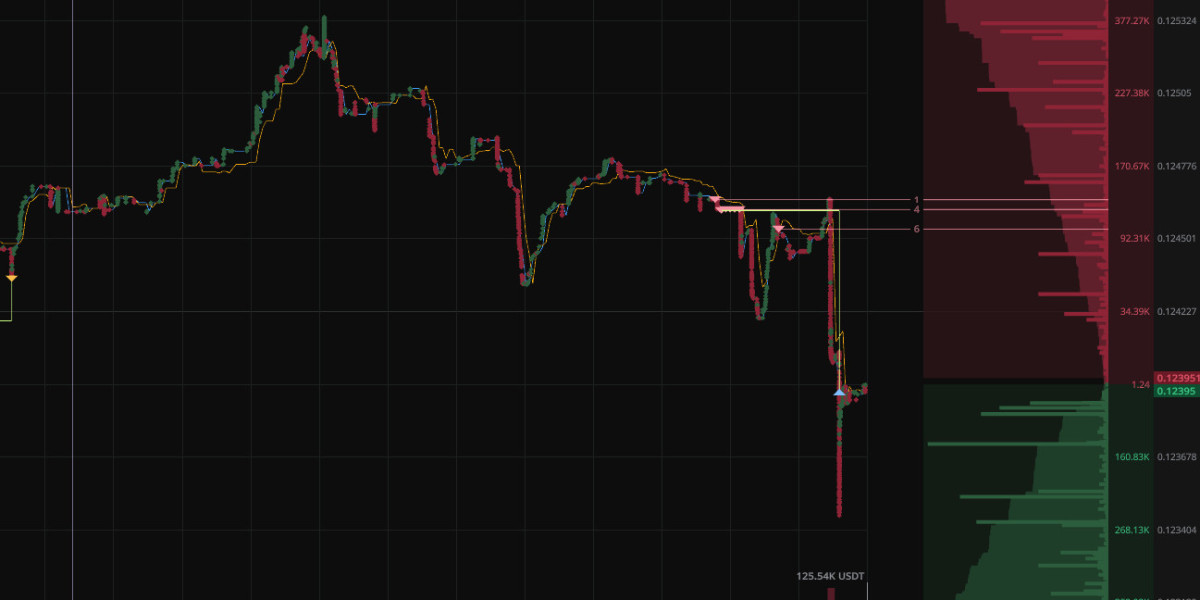
If you’ve traded crypto for a while, chances are you’re used to candlestick charts. They’re everywhere — from exchanges to mobile apps — and for good reason. Candles give you a clear, simple picture of how price moved over a set period of time. Perfect if you’re looking at trends or making decisions on higher timeframes.
But here’s the catch: candlesticks can lie by omission. They compress thousands of trades into a neat little bar, smoothing out the chaos. That’s fine if you’re holding a position for days. But if you’re scalping or running high-frequency algorithms, every second — sometimes every fraction of a second — counts.
This is where tick charts step in.
Candles: the big picture
A candlestick is built on time. One-minute candle, five-minute candle, one-hour candle — you decide the interval, and the chart will plot the open, close, high, and low within that period.
The good part is obvious: candles are intuitive, easy to learn, and give you a bird’s-eye view of what’s happening. Most trading strategies, from simple moving averages to advanced indicators, are designed to work on candlesticks.
The downside? By sticking to fixed time, you lose sight of the flow. The market might look flat for five minutes, but during those minutes, hundreds of small trades and micro-impulses could shift the balance.


